
The Kickstarter hero image: what works in 2026
Short answer: Your Kickstarter hero image needs to be a real product photo, 1024x576, no text or badges, no photorealistic renders.
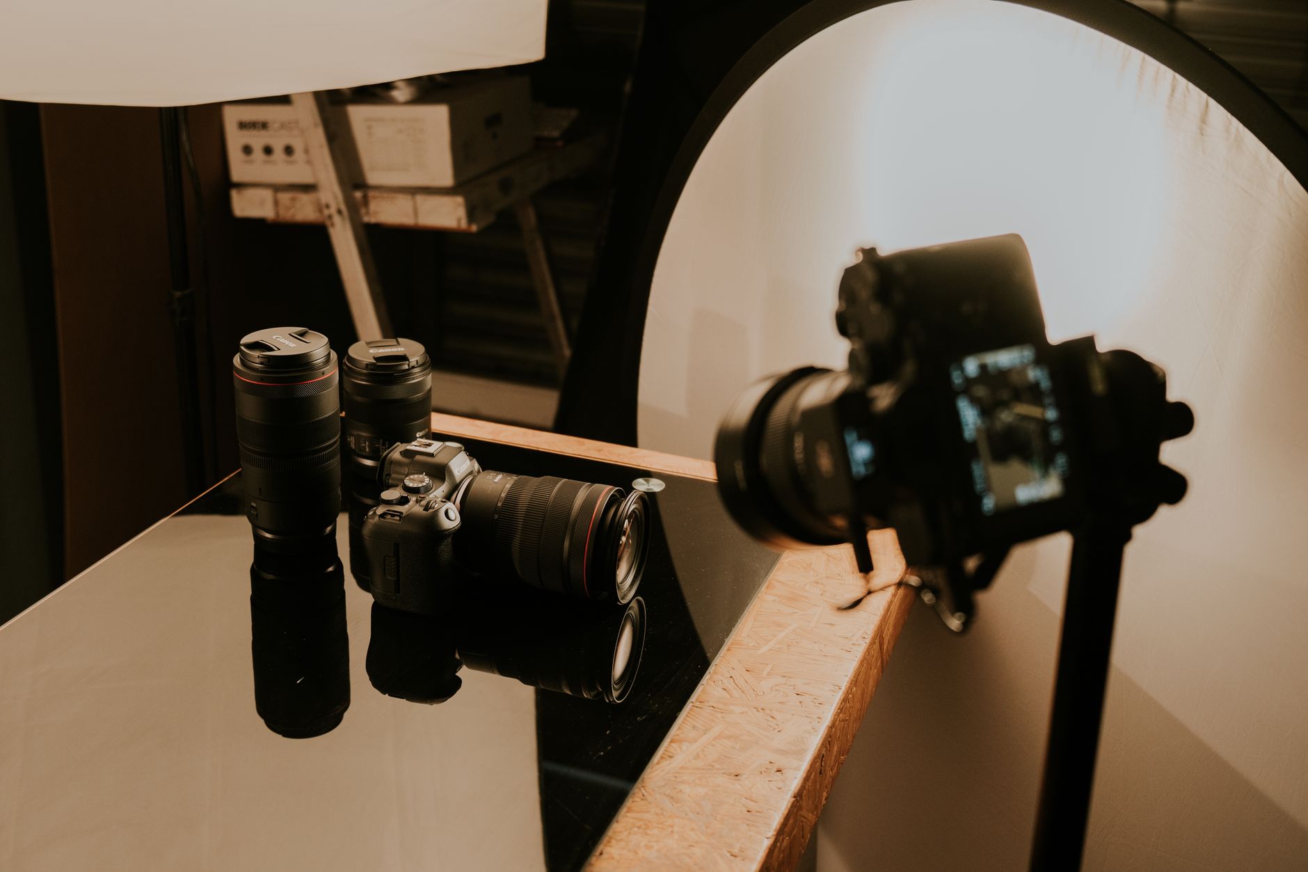
Take a walk through any Kickstarter category page and count how many hero images you actually stop on. It’s usually two or three out of thirty. That’s your competition, and that’s how much time your product has to earn a click.
The winning kickstarter hero image in 2026 is a real photograph of a real product, in use or in context, shot at 1024x576, with no text, no banners, no badges and absolutely no photorealistic renders pretending to be a finished product. Anything else is costing you clicks. As an official Kickstarter Expert Partner, I see this same mistake in campaign after campaign, and it’s the easiest one to fix.
Founders spend twelve grand on the video and about ten minutes on the thumbnail. It’s the wrong ratio. The thumbnail is the only image every single potential backer sees, whether they click or not. So let’s talk about how to actually make one that works.
The 3-second decision
A backer lands on the Gadgets category. They see roughly thirty thumbnails at once. They’re not reading; they’re scanning. Each hero image gets about three seconds of eye time, tops.
In those three seconds your image has to do two jobs. It has to communicate what the product actually is, and it has to spark enough curiosity to earn the click. If the backer can’t tell what they’re looking at, they scroll. If they can tell but don’t care, they scroll.
Most hero images fail the first test. Founders get so close to their own product that they forget an outsider has never seen it before. The teardown I’d do on your thumbnail: cover the title, show it to your mum, ask her what it is. If she can’t answer in three seconds, it’s not good enough.
What Kickstarter’s own rules actually say
Before we get into taste, let’s cover the hard rules. Kickstarter changed its stance on renders a while back and it caught a lot of founders out, so worth being clear.
Kickstarter’s official hardware guidelines require you to avoid photorealistic renders of a product concept. If a render could be mistaken for a photograph of a finished product, it’s banned. If Kickstarter’s Trust and Safety team spots it during initial review, your project won’t launch. If they spot it after launch, they cancel the campaign and refund everyone.
That sounds harsh until you remember why it exists. Backers got burned by too many render-only campaigns that never delivered a thing. The rule protects the platform’s reputation, and by extension yours.
The good news is CAD drawings, technical sketches, wireframes and clearly stylised concept art are all still fine. So are mood boards and design-process visuals. It’s specifically the “this looks like a finished product but doesn’t exist yet” render that gets you in trouble.
The other rule worth knowing: Kickstarter recommends avoiding banners, badges and text on the hero image. That includes “Coming to Kickstarter”, “As seen on”, “Award winning”, and every variant of a 5-star sticker. All of it looks like a bad Amazon listing. All of it hurts you.
Full spec, in case it’s why you found this post: 1024 by 576 pixels, 16:9 aspect ratio, under 5MB, JPG or PNG.
Why the render ban actually helps you
Here’s the counterintuitive bit. The render ban is a good thing for anyone who’s actually built a prototype.
For years the playing field was tilted toward founders with the biggest 3D rendering budget. You could ship a photorealistic hero image of a product that only existed on a hard drive, and it would out-click a real photograph of a working prototype every time. That’s over.
Now, a real photograph signals “further along”. A backer scrolling past ten campaigns with wireframes and CAD sketches will pause on the one showing a physical thing in someone’s hand. Use that.
If your prototype looks a bit rough around the edges, that’s fine. Backers on Kickstarter are more forgiving than backers on Amazon; they know they’re funding something in progress. A slightly imperfect real photo beats a suspiciously perfect render every time in 2026.
The four hero image patterns that keep working
I’m not going to give you a rigid template, because your product is your product. But looking at the campaigns that consistently land on Projects We Love or clear their goal in the first week, most of them use one of four patterns.
The product-in-context shot. Someone holding it, wearing it, using it. Human hand or human face in frame. This does two things at once: it shows scale, and it shows the product is real enough for a human to be interacting with. If you can only afford one hero shot, make it this one.
The lifestyle scene. The product placed naturally in the environment where it belongs. A kitchen gadget on a real kitchen counter with a bit of mess. A desk accessory on a real desk with a real laptop and a coffee ring. Not a studio staging where everything’s suspiciously clean. Backers can smell “staged” from a mile off.
The clean neutral background. Product hero shot on solid off-white, light grey or a subtle gradient. This works when the product IS the story, meaning the form factor is unusual enough that context would just get in the way. Jewellery, watches, art prints, small elegant objects. If your product looks generic on its own, skip this pattern.
The problem-then-solution split. Two-panel or before/after showing what your product actually fixes. Rare, tricky to pull off, but when it works it’s the most persuasive hero of the lot. Good for tools that solve a specific messy problem you can photograph.
Wrap all of these in the same rule: nothing on top. No text, no logo overlays, no arrows pointing to features. Save that for the campaign page body.
I once had a client whose hero was an AI-generated image of the product. I made them swap it for a real photo of a real person holding the actual product, and their conversion rate jumped massively. Backers spot AI now, and they don’t trust what they can’t verify is real. The product-in-context pattern isn’t just a design preference, it’s a trust signal.
What actually kills hero image conversion
The list of hero image sins I see weekly. Any one of these will cost you clicks. Doing several is why you’re wondering why your CTR is 0.4%.
Text overlays, banned and tacky. Stock templates from Canva that other founders have used, backers spot these immediately. Busy multi-product layouts where you’re showing all six colourways at once and it looks like a Wish listing. Dark or low-contrast shots that turn into a muddy blur at thumbnail size. Photorealistic renders which will get you cancelled. Watermarks. Anything with the word “SALE” on it. Your own face if you’re not personally famous.
Also worth calling out: the “hero image that’s actually the video thumbnail” trick. Kickstarter uses the hero image as the still frame behind the play button on your campaign page. Some founders slap the video’s title card in there, which usually means big text over a still. Don’t. Pick one image that works both as the category thumbnail and as the video’s paused state.
How to shoot one on a founder budget
You don’t need a photographer. You need natural light, patience, and thirty attempts.
An iPhone 12 or later, held steady, gets you 90% of the way to a professional studio shot for zero pounds. Add about £30 for a couple of white paper backdrops and a foam board reflector from an art shop. Shoot next to a large north-facing window in the morning or late afternoon; that light beats any lamp setup a beginner can rig.
Take at least thirty variations. Different angles, different distances, product on its own, product in hand, product in context. Then pick the three you like most and run them past five friends who’ve never seen your product. Whichever they can identify fastest, wins.
If you’d rather pay someone, £150 to £400 gets you a local product photographer via Peerspace, Snappr or a photography student from your nearest university. Ask to see their existing product work, not their portrait or wedding stuff. Different skill.
If you’d like a second pair of eyes on your hero image and whole campaign page before you launch, my £60 strategy call is the quickest sanity check going. I’ll tell you what to change and what to leave alone.
The Kickstarter thumbnail crop trap
Here’s the bit almost no size-spec article mentions. Your hero image is 1024x576 in the campaign page, but Kickstarter crops it differently across the site.
On the category grid it’s roughly 300x169. On the search results it’s smaller again. On the mobile app, different again. Whatever’s dead-centre is what most people actually see. The edges get chopped or de-prioritised.
Before you commit to a hero image, zoom out and view it at 300x169. Squint. Does the main subject still read? Does the product still look like the product, or has it turned into an unidentifiable blob? If your logo or key detail sits in the corner, it’s already lost.
The safest rule: put the single most important element of the image slap-bang in the middle third, and treat the outer edges as decoration only.
What to do if your prototype isn’t photogenic yet
Sometimes the product just isn’t ready for its close-up. The 3D-printed prototype has visible layer lines. The colour’s wrong. The finish is placeholder. Fine.
Kickstarter’s rules explicitly allow technical drawings, CAD, exploded views, sketches and design-process visuals. Use one of those with confidence. A clean technical drawing signals “we’re at engineering stage” honestly, which reads as more credible than a suspiciously polished render.
The trap is trying to Photoshop your rough prototype into looking finished. It never quite works, it always looks slightly off, and if a Trust and Safety reviewer decides it crossed the line into “photorealistic render”, you’re cancelled. Better to be honestly early-stage than dishonestly polished.
If you go the CAD route, keep the aesthetic consistent across all your campaign page images. Don’t mix one photo, three renders and a sketch. Pick a visual language and hold it.
For more on how the hero fits into the rest of your page, my post on writing a Kickstarter campaign page covers the sections that sit under it. And if you’re still in pre-launch, your landing page hero is basically the same problem in a different container.
The turn
Founders will happily spend £8,000 on a launch video that half their backers skip, then use whatever hero image they had lying around from their Instagram feed. The ratio is completely wrong.
Your video is important, obviously. My video that converts post gets into that. But the hero image is the single most-viewed asset of your entire campaign. Every ad you run, every email you send, every share on social, every category page visitor: they all see the thumbnail first. Many will never see anything else.
Spend a day on it. Shoot thirty versions. A/B test three in your pre-launch ads. Then pick the winner with data, not with the opinion of your co-founder who insists the moody dark one looks “premium”. Moody dark thumbnails die in the category grid.
Key takeaways
- Kickstarter hero images are 1024x576 pixels, 16:9, under 5MB.
- Photorealistic renders that could pass as finished products are banned and will get campaigns cancelled.
- Text, banners and badges on hero images are against Kickstarter’s guidelines and hurt clicks.
- CAD drawings, sketches and technical illustrations are still allowed and often more honest.
- In-context or lifestyle shots outperform isolated studio product shots at thumbnail size.
- Design for the 300x169 grid crop, not just the full 1024x576 frame.
Want a hand with yours?
If you’d like someone to actually shoot or art-direct your hero image, my hero image add-on covers exactly that. It’s built for founders who’ve got the product but don’t trust their own eye for the thumbnail.
If you want a full second opinion on the whole page and not just the hero, coaching is the sensible tier. Or start with the £60 strategy call and we’ll figure out which bits are worth spending money on before you commit.
Frequently asked questions
What size should my Kickstarter hero image be? +
The hero image is 1024x576 pixels at a 16:9 aspect ratio. Kickstarter crops it down to roughly 300x169 in the category grid, so whatever's dead-centre is what most people see. Design for the crop, not just the full frame.
Can I use a 3D render as my Kickstarter hero image? +
Not if it could be mistaken for a real finished product. Kickstarter's rules ban photorealistic renders and will cancel projects that use them. CAD drawings, sketches, wireframes and clearly stylised concept art are still allowed. If your prototype isn't photogenic yet, a technical drawing is a safer, more honest choice.
Can I put text or badges on my Kickstarter hero image? +
No. Kickstarter's own guidelines say to avoid banners, badges and text on the hero. The category grid is already busy, so overlaid text tends to look tacky at thumbnail size anyway. Let the product carry it.
How much should I spend on a Kickstarter hero image? +
You can shoot a decent one with an iPhone, natural window light and around £30 of paper backdrops. If you'd rather hire someone, £150 to £400 gets you a local product photographer or a decent uni student. It costs less than the video and matters more per pound spent.
What's the best type of hero image for a Kickstarter campaign? +
A real photograph of a real product being used by a real person, on a clean or lightly styled background, at 1024x576. In-context and lifestyle shots tend to beat isolated studio shots because they show scale, use and reality all in one frame.